< Home
A5 Booklet
PUBLICATION DESIGN | HAEMOCHROMATOSIS UK
Prev
Next
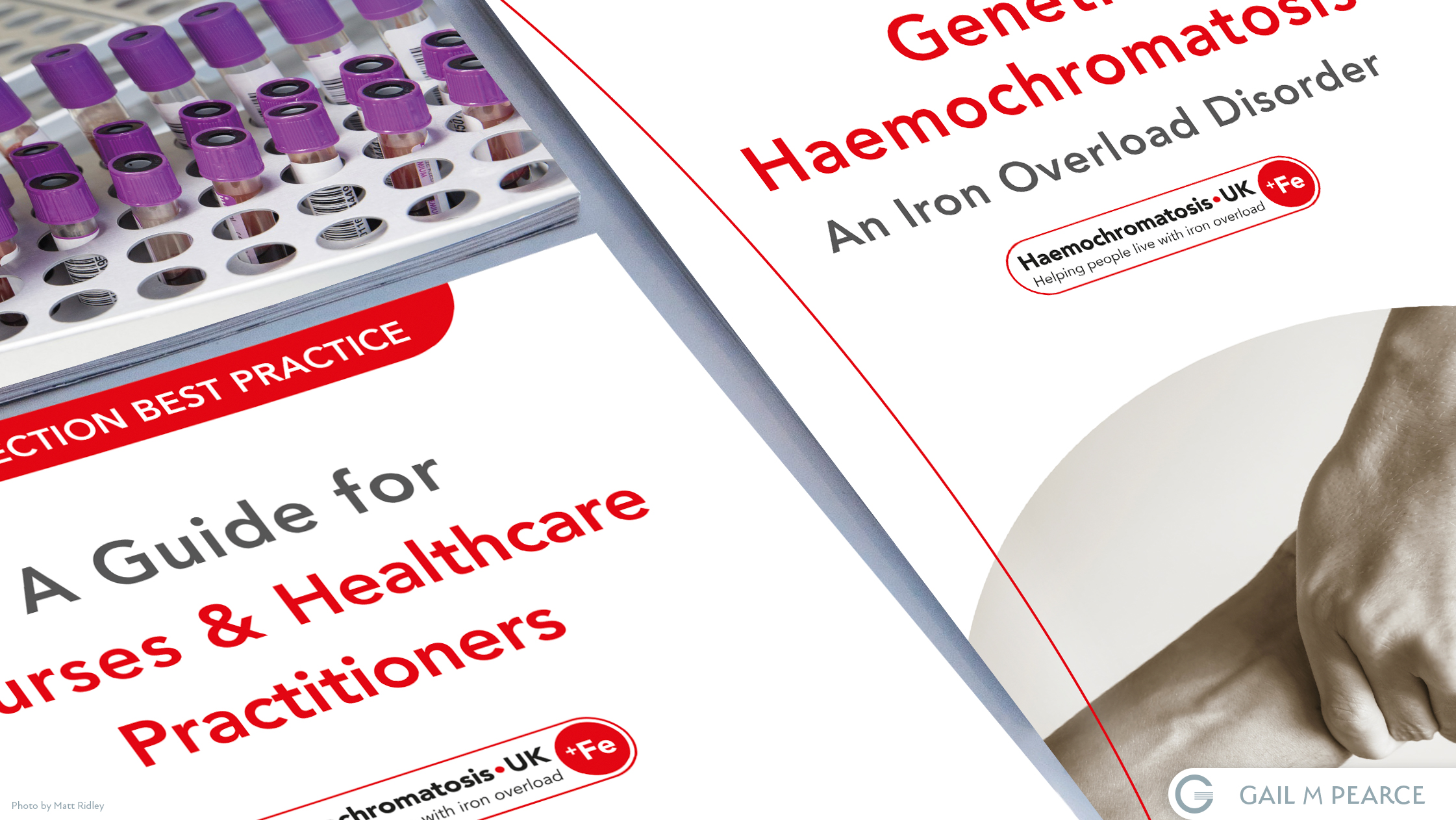
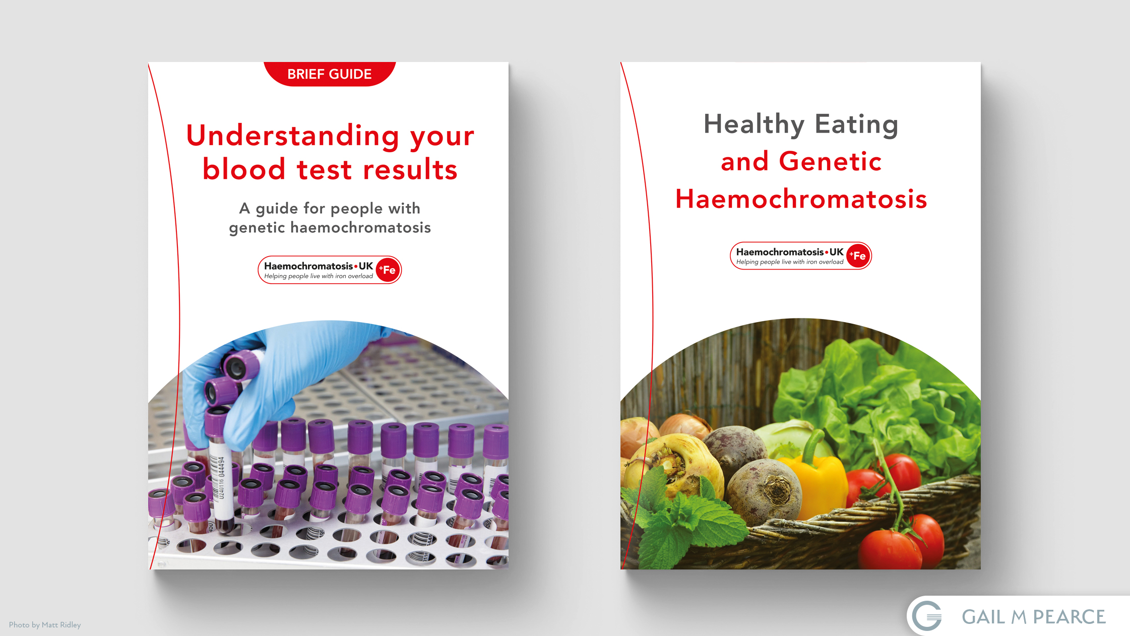
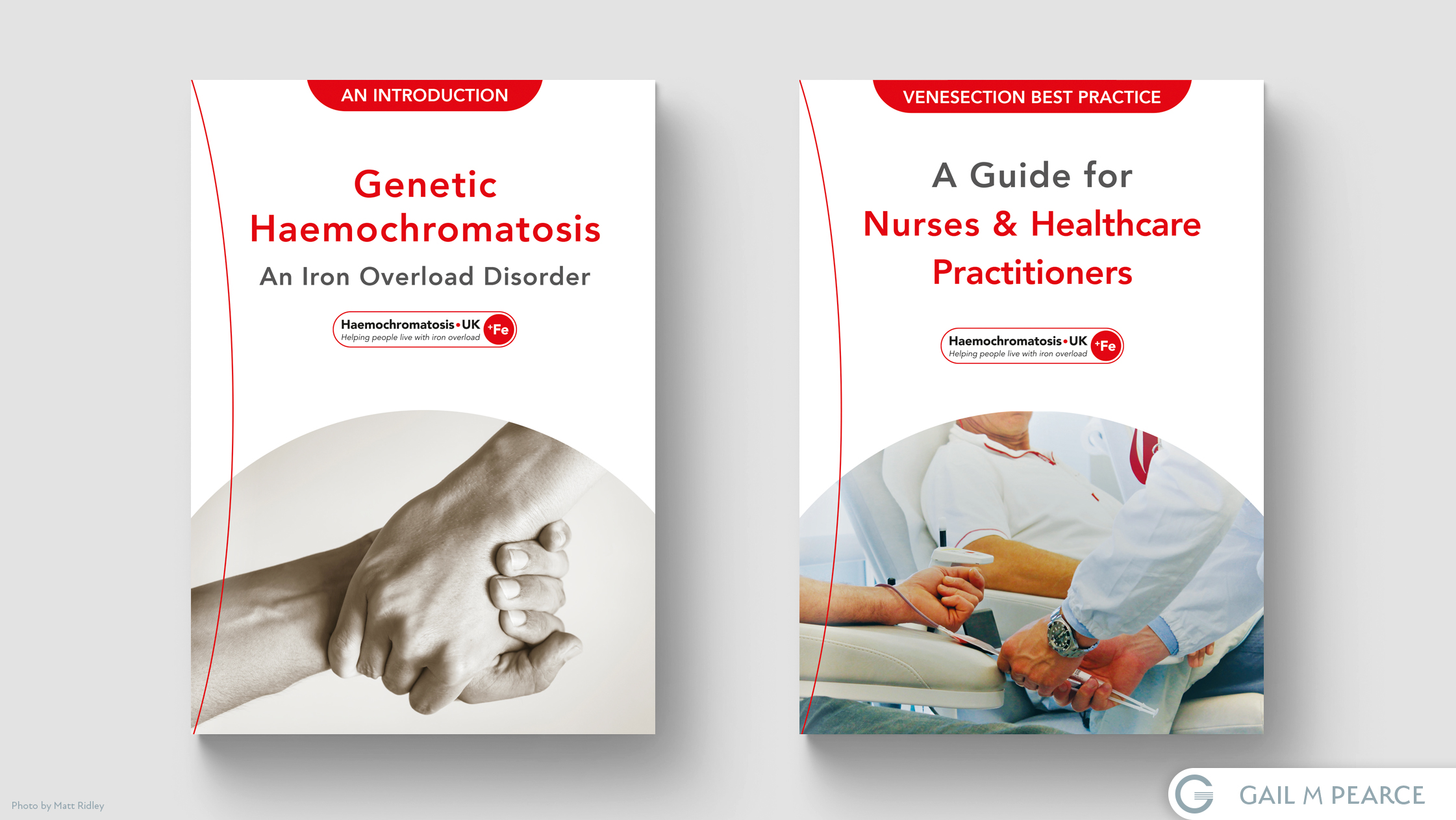
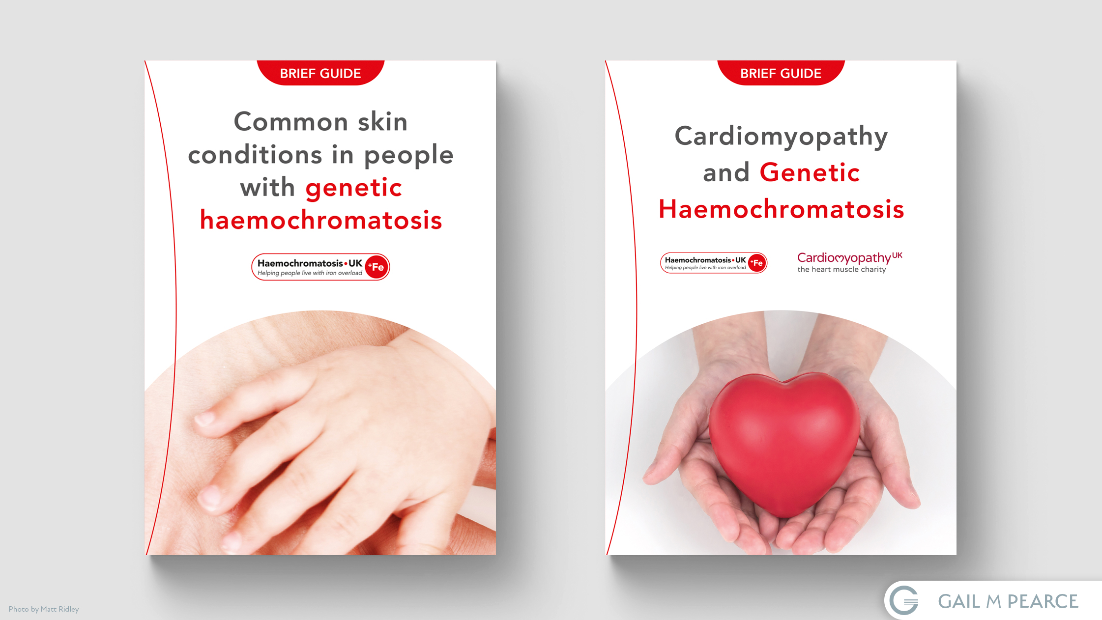
Haemochromoatosis UK approached me with a request to create a consistent look and feel for their growing range of health booklets. Because the not-for-profit did not have formal brand guidelines in place, I took inspiration from their logo – using a ‘curve’ to represent the iron overload component found in patients diagnosed with Haemochromatosis. The image placement on the front cover allows for easy adaption from booklet to booklet (no matter the subject matter), and the hierarchy and use of white space meant that the title of the booklet was always the most prominent feature on the shelf.
Prev
Next